

This tutorial will teach you how to use the RGB colour wheel and the HSV colour format to create a variety of colour schemes for digital art. You will learn how to adjust brightness, saturation and shift the hue of colours to create interesting colour palettes.
We will cover these colour combinations:
- One bit (1-bit)
- Monochromatic
- Complementary
- Split-Complementary
- Analogous
- Triadic
- Tetradic (rectangle and square)
But first a little history lesson.
Newton Disk
Isaac Newton discovered the Newton disk colour wheel in 1666 by refracting light through a glass prism. The Newton disk is made up of the following colours: red, orange, yellow, green, blue, indigo, and violet. Which is commonly abbreviated as ROYGBIV. These colours make up the conventional gradient of a rainbow. The Newton disk appears close to white in colour when it is spun quickly.

The Newton disk image comes from the Wikipedia page.
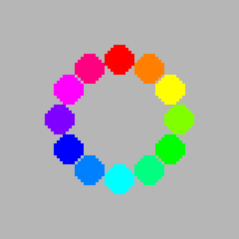
RYB Colour Wheel
This is a RYB colour wheel, which is commonly used by artists to combine paint colours. Since this tutorial is for digital artists, we will not be using it. However all the colour combinations we will look at later also work with this colour wheel too!
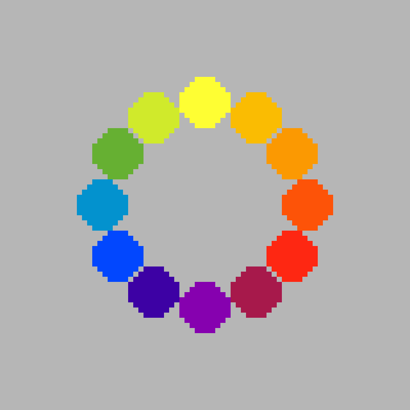
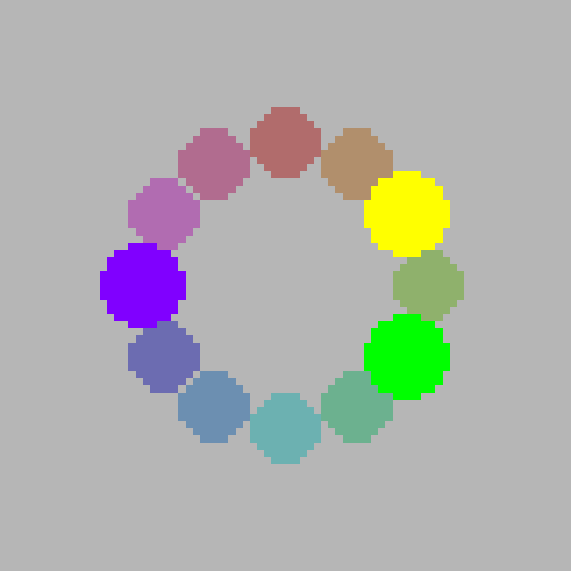
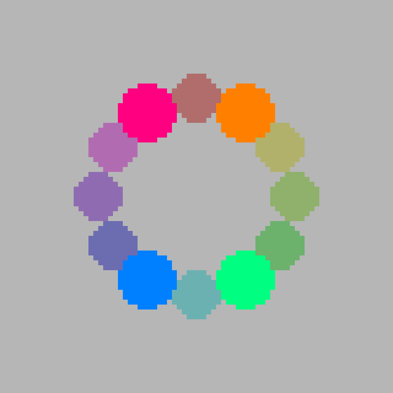
RGB Colour Wheel
This tutorial will use the RGB colour wheel below, which is suitable for digital artists and pixel artists.
HSV
HSV is a colour format which uses 3 properties to represent a RGB pixel colour:
- H for Hue – 0 to 360 degrees
- S for Saturation – 0 to 100 percent
- V for Brightness – 0 to 100 percent
The hue is usually in the 0 to 360 degree range. It is used to represent the degrees of an arc. Where 360 degrees would create a full circle. A value over 360 degrees loops around back to 0. Essentially the hue allows you to change the colour from red to green to blue, or anything in between.
The RGB colour wheel above is made up of 12 colours. Where 1 colour is plotted every 30 degrees. Since 360 divided by 12 equals 30. We could of course make a colour wheel with more or less colours if we wanted to.
The saturation and brightness are commonly in the 0 to 100 percentage range.
The saturation shows how vivid or muted a colour appears. A high saturation means a bright, intense colour, whilst a low saturation means a desaturated or muted colour, often appearing grey.
When the saturation is 0, we get a greyscale colour in the range of black to white.
The brightness shows the lightness or darkness of a colour. Where 0 is black, and 100 is white.
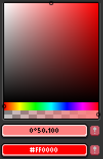
Here is how the HSV sliders look in the Aseprite image editor.

The Aseprite colour picker looks like this. The left side of the rectangle is 0% saturation, and the right side is 100% saturation. The top side is 100% brightness, and the bottom side is 0% brightness. The hue and transparency can also be adjusted, by using the sliders below the larger rectangle colour picker.
One Bit
A 1-bit palette contains only two colours. Usually a bright and a dark colour to create contrast. It is a very simple colour palette, but also very limiting.

You can get maximum contrast with black and white.

Or you could pick colours which have a little less contrast, but can be easier on the eye. Such as light grey and dark grey.

There won’t be much contrast when the colours are close together.

You can use any colour with 1-bit, not just greyscale.
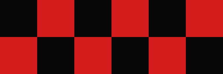
Dithering can be used to create a third colour, by creating a gradient using two alternating colours. This will trick the human eye into thinking the two colours are blended together, when they are viewed from a distance. There are many kinds of dithering patterns, feel free to experiment.

You can also use gradients to blend 2 different colours together, such as the linear gradient below. Gradients look cool, but they introduce many colours into your image, and this defeats the purpose of using a limited colour palette.

Monochromatic
To create a monochrome palette, all you need to do is keep the hue the same. You can set the brightness and saturation to whatever you want. Monochromatic palettes are easy to use, and produce a cohesive and harmonious design.
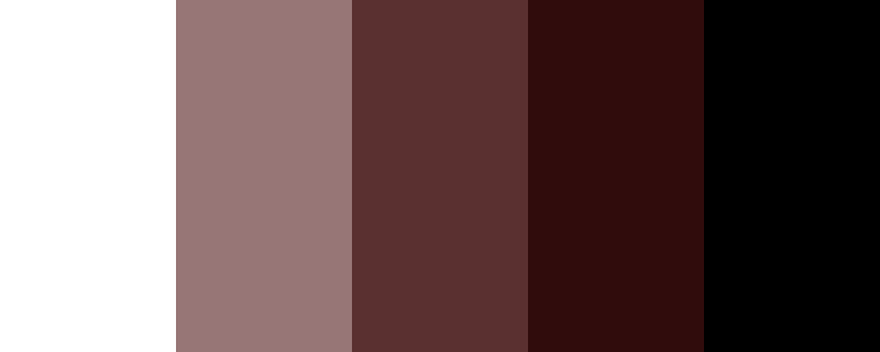
In this case, I have selected 5 colours in a mostly straight line from black to white, with a hue of 0.


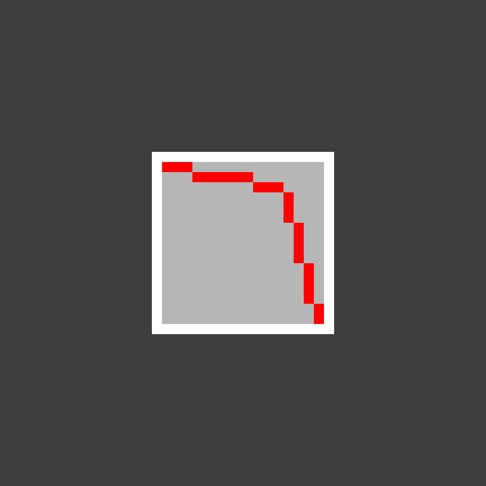
You can get more interesting colours by selecting colours in a curve. In this case, I used an upward curve. This palette is more saturated and brighter.


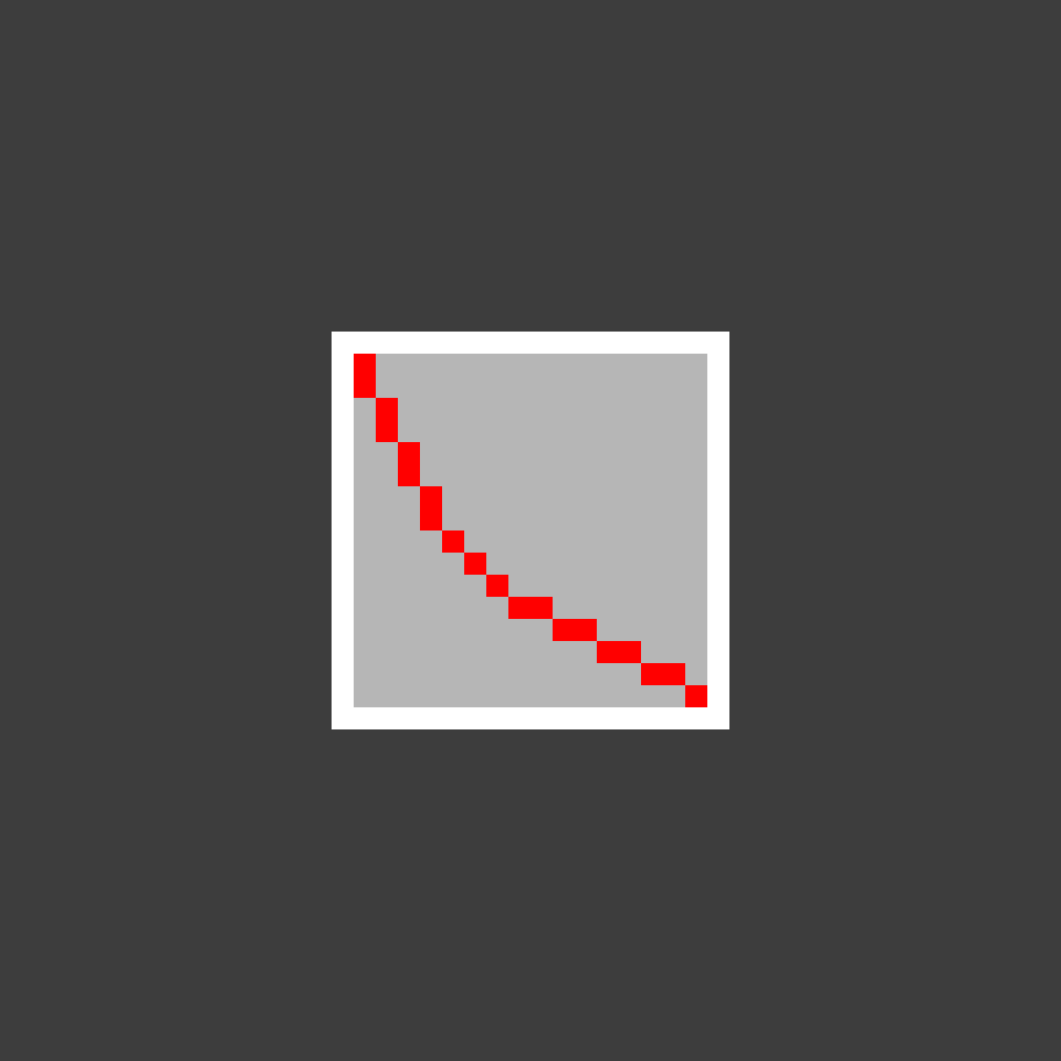
This downward curve has more desaturated and less bright colours.

Usually the highlight colours are bright and desaturated. The shadow colours are dark and saturated. Whilst the midtones will be in the middle. Try experiment with your midtone colours, by playing with the saturation and brightness to create different curves.
Hue Shifting
We can make colours more interesting by hue shifting them. Since this mimics how colours shift in real life due to light and shadow. Usually highlights will be hue shifted towards yellow, since it has a warm feel. Shadow colours will usually be hue shifted towards blue, because it has a cold feel.
Here is a green colour palette with strongly hue shifted colours.


Here is a green colour palette with slightly hue shifted colours.


And the same green colour palette without hue shifted colours. This version is monochromatic.

Here is a sunflower drawing. The left one uses the strongly hue shifted colours, the middle one has a normal amount of hue shift, whilst the right one doesn’t use hue shifting.

They are all fine, but I prefer the strongly hue shifted version. It looks a little more interesting, and it can make artwork look more realistic.
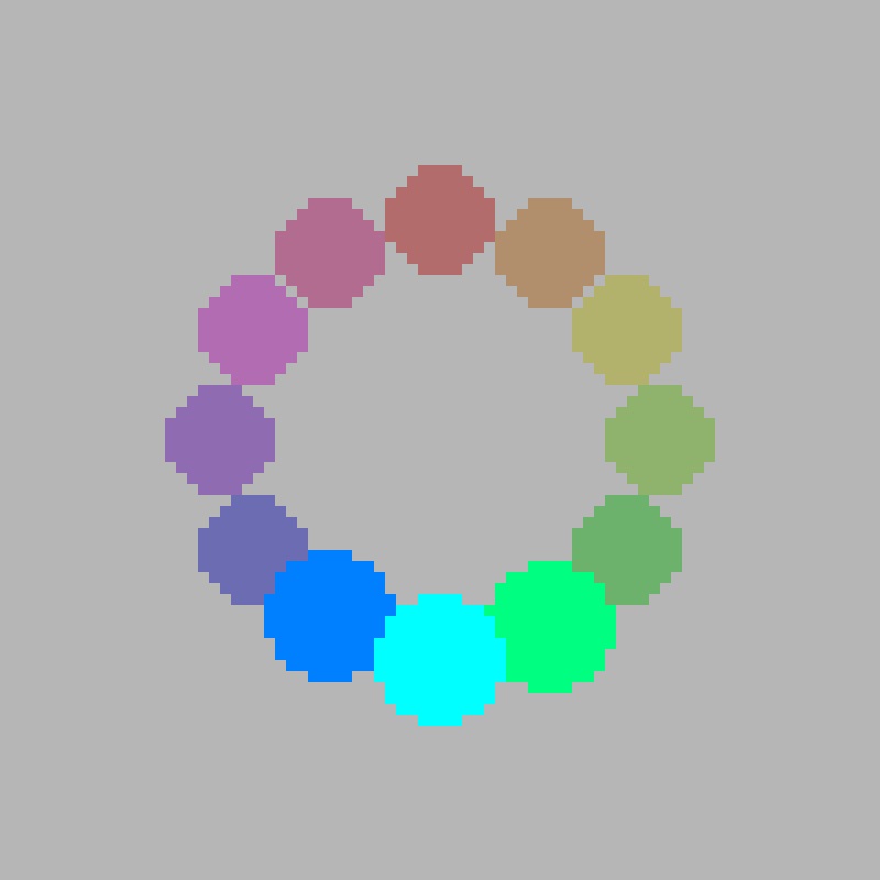
Complementary
Complementary colours are directly opposite on the colour wheel. Therefore the hue of both colours are 180 degrees apart. This combination creates a high contrast, vibrant and dynamic visual style. A warm colour and a cool colour are often paired together.


Split-Complementary
The Split-Complementary combination is similar to the complementary combination. You pick a colour, then pick the two colours on either side of its complement. This combination is more subtle, offering a softer and more balanced contrast, but it is less vibrant than a complementary combination.

Analogous
Analogous colours are adjacent on the colour wheel. You pick 1 colour, and both of its neighbours. This combination is often found in nature, and is used to create a sense of visual balance and harmony. Usually one colour is used as the dominant colour, whilst the other 2 are used as accents.
Triadic
The triadic combination uses 3 colours. The colours are evenly spaced out on the colour wheel, forming an equilateral triangle. Therefore the colours are 120 degrees apart from each other. This combination is harmonious and balanced, and can be used to create bold and vibrant palettes. Usually one colour is used as the dominant colour, whilst the other 2 are used as accents.


Tetradic
The tetradic combination uses 4 colours. There are two types of the tetradic combination. One uses a wide or tall rectangle, whilst the other uses a square shape to select the colours. Usually one colour is used as the dominant colour, whilst the other 3 are used as accents.
The rectangle combination uses two pairs of complementary colours. This creates more variation and a richer visual style.

The colours are evenly spaced out on the colour wheel for the square combination. Therefore the hue of each colour is 90 degrees apart from the next two nearest colours. This creates a balanced and vibrant visual style.


Conclusion
Thanks for reading this tutorial. You have learned about the history of the colour wheel, and how to use the HSV colour format to create a variety of interesting colour schemes for digital art and pixel art.
Cheat Sheet


2 responses to “A Guide to Creating Colour Schemes for Digital Art”
This is very cool! I love working with good color palettes 🙂
Thank you, Jordan! It is definitely fun to work with different palettes 😀